Why an “About Us” page is so important
What’s the most important page on your website, after your homepage?
Often it’s your “About Us” page—the page that introduces yourself to your website visitor, tells them what you do and builds a rapport that will hopefully turn them into a customer. So think of your “About Us” page as speed-dating with a potential customer. They’re on the prowl for the right business and you only have a few short moments to win them over. And that might not be as easy as you think. Nielsen Norman Group (NNG) recently found that, while the usability of “About Us” pages has improved 9% over the past five years, paradoxically, user satisfaction has actually dropped from 5.2 to 4.6 (on a 1-7 scale). Why? Because nowadays people expect more.
In the middle of building your website?
If you haven't tried Rocketspark's website builder, give us a free 30-day test drive. Add and layout content quickly with stacks and blocks. Just follow the link below to your closest hosting:
United Kingdom hosted website builder
Australian hosted website builder
New Zealand hosted website builder
So here are some tips for making a top-notch “About Us” page, so you can speed-date your way to more customers. Ready...Set...Go!
Goods and services: “So, what do you do?”
It’s crucial that your “About Us” page says what goods or services your business provides. This might seem like a no-brainer but it’s a surprisingly tricky thing to get right, especially if your business deals in a jargony, technical field. We speed-dated (i.e., checked out the “About Us” pages) 10 Xero (accounting software) accountancy firms in the Waikato, New Zealand, and found that 20% of the pages we assessed still left us with no idea what the business does. Chances are, if a user can’t figure out what your business does from your “About Us” page, they won’t stick around to find out.
The key thing to remember here is not just that you need to say what you do; you have to say what you do in a way that’s easy to understand. NNG actually found that the ease of finding out what a business does from their page has dropped 9% over the past five years. Why? Because, in their words, “marketese and blah-blah text ruled the day on many sites.” So don’t just copy-and-paste your company mission statement onto your page. That might look great to the execs but it doesn’t mean anything to the average user. Explain your core business using plain English in an engaging way.
Images: “Wow, you look great!”
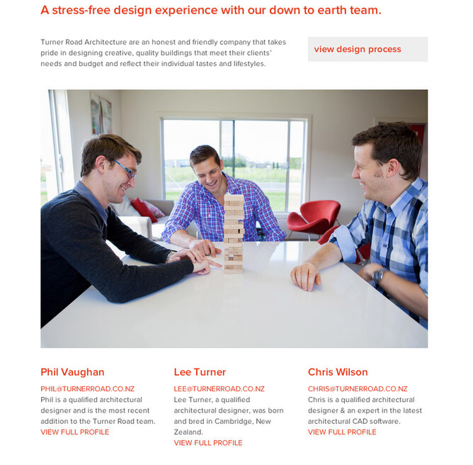
Including images on your “About Us” page isn’t just about making it look pretty (though that certainly helps)—it’s about building trust. Doing business on the internet is all about trust. Users will be evaluating your page asking: Is this a business I can trust to deliver? And one excellent way to build trust with potential customers is by including photos on your page. Research shows that pictures of people (as opposed to things) increases user trust. And, just in case there was any doubt, the research also shows that trust produces leads and sales.
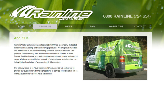
Faces build rapport. Of the accountancy websites we looked at, 20% had no photos at all on their page. The result? Those businesses felt like cold, distant entities. Users want to see your people (stock photos are a no-no!), so include a group photo or individual photos of your staff. This is important even if you’re a sole trader because putting a face to the name really helps give you a credibility-boost, no matter what your size. You might also like to include photos of your brick-and-mortar store, signwritten company vehicles, uniforms etc. to show that you’re a credible, real-world business—not just a cyber-phantom looking to scam a few bucks out of people.
Authenticity: “You’re so real.”
A common approach to gaining user trust is to use formal, stiff-and-starchy corporate-speak. But not only is this writing tough to understand, it can easily backfire, making your business look aloof at best and dubious at worst. Users want to know that you’re a real, viable business—one they can trust. You want your business to come across as “human.” 40% of the pages we looked at failed on this front.
You can improve the “humanness” factor of your page by presenting your business with a bit of creativity and pizzazz. The best “About Us” pages really show off the business’s personality. Some brands and industries might require a more formal approach, but generally the more human you can come across, the more likely users will be to trust you. Even in an industry like accountancy, where conservativeness and precision are paramount, coming across as authentic and human will really help. One of the accountancy firms we evaluated had a page with real “attitude,” and it didn’t compromise their professionalism one little bit.
One really compelling way to do this is to tell a story. Stories are a deeply human activity and can establish a strong sense of connection. Tell the story of how your business came into being or some other part of your history that really speaks to what your business is all about.
Navigation: “Where have you been all my life?”
You might have a mind-blowingly brilliant “About Us” page, but if users can’t find it then it’s not much use. That means your homepage needs to have a direct link to your “About Us” page that’s easy to spot. NNG found that there were two types of hard-to-find “About Us” pages:
Link buried among a bunch of advertisement-like graphics, called “banner blindness.”
Link labelled something obscure, like “Info Centre.”
It’s this latter issue—giving your page a non-standard name—that poses the biggest threat to the findability of your page. The easiest solution is to simply name the page “About Us” or “About [Company Name],” but there are other options too. More creative names, like “Who Are We?” or “Meet the Team,” work fine, but less obvious names run the risk of being overlooked.
Call to action: “Can I get your number?”
So a user loves your “About Us” page—then what? Your page needs a call to action. Something for the user to do next. A meagre 40% of the pages we assessed included a call to action. What a wasted opportunity! This is the perfect place to put contact details. Some websites seem intent on burying contact details in the farthest, cob-webby reaches of their site but, as NNG points out, doing so will make your credibility drop fast. Users will start wondering why and what you’re trying to hide. The best speed-dates end with giving out your phone number and so do the best “About Us” pages! Don’t forget to put your company contact details there so that they can get in touch.
Another option is to have a link to your online store. By doing this, you’re making it as easy as possible for a user to convert to being a customer. If they like who you are, they can simply click the button and start buying. Check out our button block tool to create a button.
Re-Cap. What makes a great 'About Us' page?
As you can see, there’s quite a bit more to a great “About Us” page than you might think. Remember these key points:
Say what your business does in a way that is easy to understand.
Images show that you’re a legitimate business.
Be “human,” easy to understand and relatable.
It needs to be easy to find from the homepage.
Include a call to action.
Do these five things and you’re well on your way to having an out-of-this-world “About Us” page. Only two of the pages in our research included all of these elements, and only one of them did so exceptionally well. That means that carefully constructing your page will really help you stand out from the crowd. Your “About Us” page—just like speed-dating—is all about dressing to impress.


