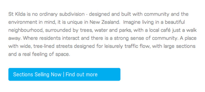
Website call to action = Asking visitors to do something.
This might be as simple as “call us on 0800 762 538”. Unless they’ve come to your website specifically to get your phone number, most visitors aren’t going to be ready to call you just yet. The fruit isn’t ripened. You need to warm them up to the idea - and do it quickly.
The call to action button
Website visitors are impatient, make it easy for them. If they have to think about what to click on for too long they’ll leave your site. This is why the call to action button is so effective. If your website navigation menu is like a map of the pages on your site, a call to action button is turn by turn directions. The less choices you give the visitor at one time the faster it is for them to navigate your site. One call to action button is best, two is still good and three is ok. Picking one or two call to action buttons for your home page tells the visitor that clicking on these buttons is the most important thing you want them to do.
Call to action buttons on other pages of your website
Once you have an effective call to action button on your homepage, visitors will be navigating to these other pages. Don’t make a page a dead end! For each page of your website, think about which page you want visitors to go to after the current page. By providing signposts you can guide your visitors through your website. At the point where you think you’ve warmed up visitors enough, that’s where call to action buttons should lead to the contact page or phone number. Potential customers might be ready to make contact with you after visiting your About Us or Services pages.
Don’t make visitors go round in circles. Don’t have a call to action button that takes them back to the page they were just on. It’s not always easy to know the order in which people will navigate your website but the main thing is that you’re trying to guide people forward through the site.
Your home page might not be the first page people visit. Other pages of your website can get indexed in Google so look at all pages as if they might be the first page on your site that visitors see. Is this page engaging? Is there a call to action asking the visitor to do something?
Make the call to action button text descriptive
The button text should describe in a few words what the visitor can expect to find if they click the button. Text like find out more or click here won’t make them want to click as they won’t be sure what they’ll find. By comparison, button text like “Why choose us?” or “View our services” describes the kind of information they can expect if they click on the button. If you can weave search engine friendly keywords (i.e. the phrases people are searching for) into your button text this can help with your search engine optimisation (even with internal links).
Other calls to action | Social media and email database subscribe form
You can also ask visitors to subscribe to an email newsletter database so you can capture their email address and send them email newsletters in future. Having a link to your social networks like Facebook, Twitter, LinkedIn etc and asking people to follow you is another type of call to action. Both of these call to actions give you an ongoing channel to connect with your visitors as a result of their initial visit to your website.
Rocketspark makes it easy to create buttons and links on your site. Check out these useful guides:
Creating buttons on your website


