In my first year of university, my lecturer was talking about the film term “spectacle”. He described it as the thing about a film that makes you forget about how comfortable your seat is. When a film lacks spectacle, that’s when you start noticing how uncomfortable your seat is. It’s the multi-sensory moments in a film that keep you hooked on the story. Moments that are created using a combination of what’s known as film conventions—things like storylines, editing, shot composition, lighting, soundtrack and themes.
Give your viewers an Oscar worthy website experience
Great web design is very similar to a film’s narrative in that there is an opening, a middle part of the story and an ending (call to action). If your website is poorly designed and overall just lacks spectacle, your visitors won’t reach the middle part of the story and won’t follow through to the end to take action.
Know your audience to build a clear website strategy
In another screen and media studies paper, the lecturer explained the difference between Hollywood films and foreign films. Hollywood films use an expected library of narratives, composition, lighting and soundtrack that are familiar to viewers. Things like happy endings, a protagonist that overcomes the antagonist in the climax of the film, editing that adjusts to the pace of action, orchestral strings matching the emotion of that part of the film.
While foreign films can be very thought-provoking and engaging, they can also be quite jarring or exhausting to watch as they can be unfamiliar, unexpected, busy and don’t always offer a resolution. Just like with film, the brief for some websites can ask for jarring, edgy or thought-provoking design (artists, musicians or anyone looking for their website to be an expression of their art). However, for most service and ecommerce businesses the website’s design should be a visual extension of their customer’s experience of their product/service.
Spectacle, meet comfort
The concept of comfort in web design is most simply thought of in the context of interior design. When you walk into a great lounge, work environment or bedroom, certain elements of the design make you feel comfortable and not overwhelmed, for example:
- The right amount of furniture to suit the room.
- The right amount of visual interest on the walls–but not too much.
- Lighting that sets a particular feeling or mood.
Web design is very similar to film in this regard. Balancing spectacle and comfort is the secret to the best business website designs on the planet. Spectacle keeps visitors interested and engaged, comfort helps them quickly understand what the website or webpage is about and makes them feel like the information is coming easily and without too much effort from them.
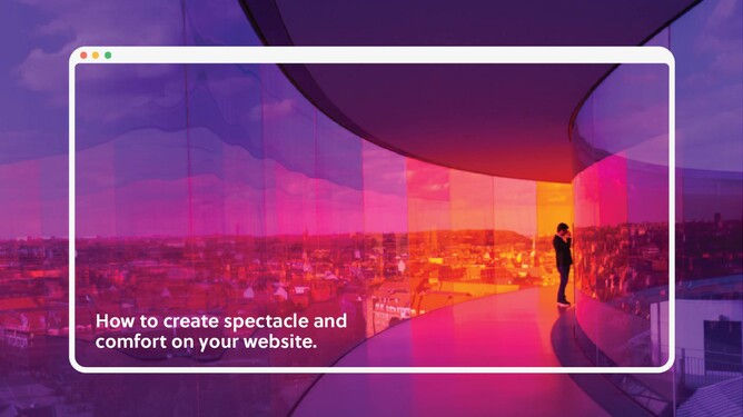
How to create spectacle and comfort on your website
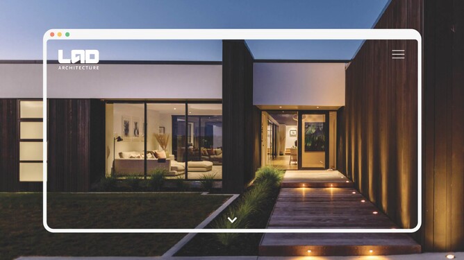
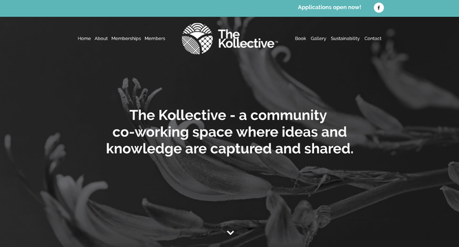
One of the best ways to create those wow moments of spectacle is with large, high-quality imagery — photo and video. Working with a local photographer and investing in high-quality photography for your website isn’t as expensive as you might think and depending on your industry, you might only need to pick up one more client as a result of the photos to make it pay for itself.
The longer a heading is, the smaller the font size has to be to make it fit, so this might be something to avoid. Long headings also reduce comfort as there’s more reading effort for the visitor. So find concise ways to say the same thing with your headings so they can be larger in size and more impacting.
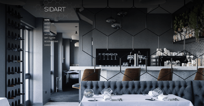
Another way to create wow moments is by changing the backgrounds of different sections (or stacks) down the page and alternating between full width photo backgrounds and feature background colours (a little like a feature wall in our interior design example).
But don’t forget about comfort — if every section is a different colour or you overdo photo backgrounds, it’ll feel busy and overwhelming. Have an anchor background colour that is used the most to create a visual reference point for the visitor so they know which sections are highlighted by the different background colour or photo background.
When it comes to comfort, spacing is everything. If elements are too close together, they will compete for your viewer’s attention. By adding plenty of space between elements it gives the eye room to breathe so each piece of content can be absorbed without distraction.
Also think about the user journey through a web page or a website and simplify the decisions that the visitor has to make. According to Hick’s law, the fewer decisions a person has to make, the faster they will make a decision.
Balance spectacle and comfort for great web design
So next time you’re starting on a new website, think about how you can achieve those moments of spectacle in your website design by balancing it with comfort to make the website experience feel effortless for the visitor.