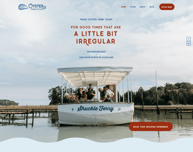
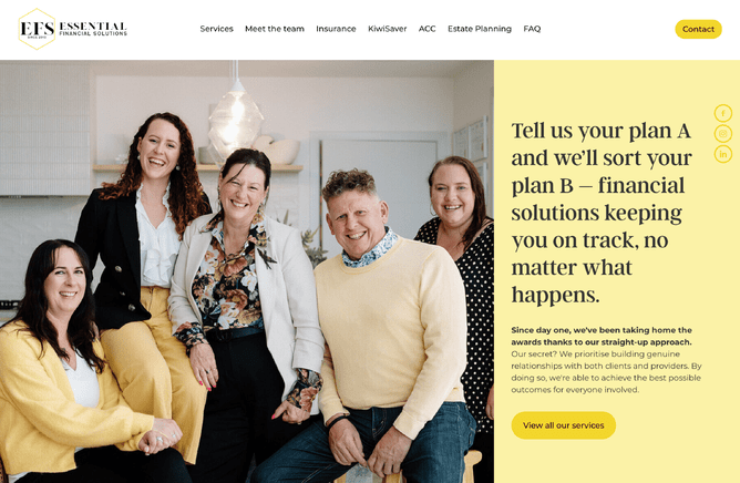
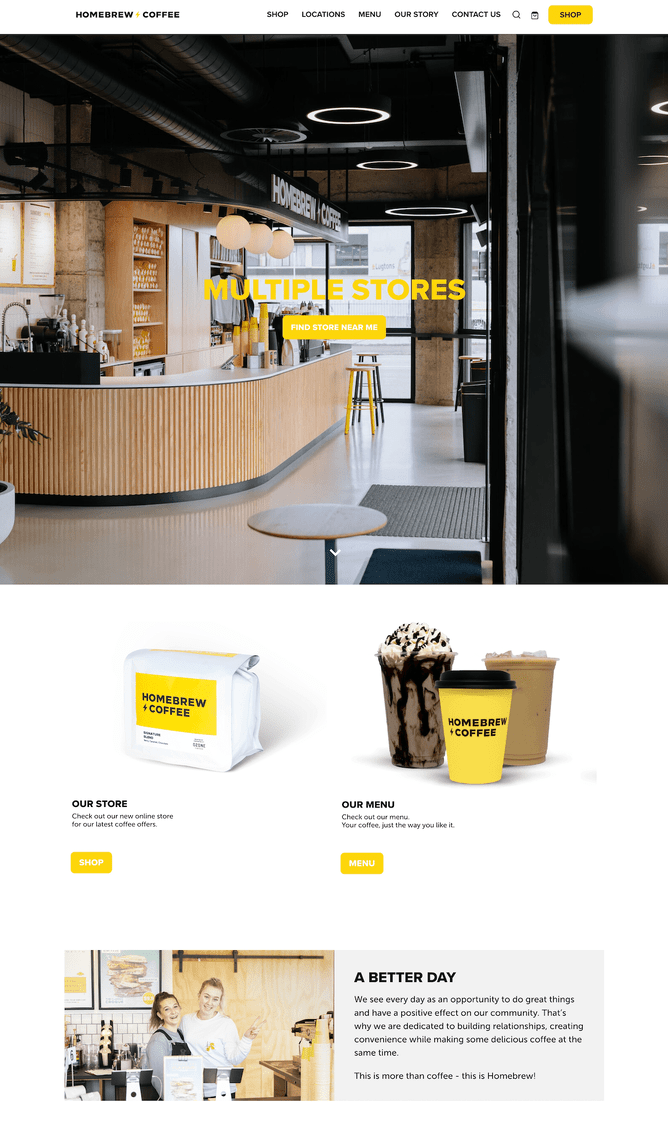
When the economy tightens, every dollar really starts to matter. With the high cost of living, people are more cautious about where they spend their hard-earned cash. For small service businesses, this change in behaviour can be a bit of a mixed bag. It's a tough time, but also a great chance to stand out. And one of the best ways to do this? Having a solid website.
As a business owner, it might be tempting to cut costs when money's tight. But when customers are being careful with their spending, a good website becomes even more important.
The power of a good website
A few weeks ago, I was in Auckland for a week, battling some tight shoulder and neck muscles. Determined to find some relief, I researched options for saunas, cold plunges, and massages in the area. I spent a good chunk of time sifting through various websites, comparing services, prices, and reviews. In the end, one place stood out—not because their website was amazing, but because it was better than the others, with clear photos.
I also checked out their Instagram profile to evaluate credibility—it showed images of famous sports people using their facility. The website and the social media profile were then working together to build trust.
The lesson here is simple: even in the digital age, a good website can make all the difference. It shows that a business is serious about its online presence and, by extension, serious about its customers. Check out our easy-peasy homepage guide to see how your website’s doing.
Even if you get a lot of your business via word of mouth, a website can still be effective at inspiring word of mouth referrals to make contact. Check out our blog about how a website can help with word of mouth business.
Making a choice: the real test
Think about it—when you're looking for a service, whether it’s a plumber, a hairdresser, or a massage therapist, the first place you often go is online. A business with a well-designed, informative website immediately has an edge. While aesthetics can be powerful for a first impression, it’s not just about aesthetics—it’s about communication, professionalism, and customer focus.
Here’s why a good website is crucial:
Communication: A well-structured website clearly communicates what services are offered, pricing, and how to get in touch. It’s a sign that the business values clarity and customer convenience.
Presentation: First impressions count. A website that looks professional suggests that the business is professional. It’s a reflection of how seriously they take their work.
Customer focus: A website that’s easy to navigate, informative, and user-friendly shows that the business prioritises the customer experience.
Quality images: Being able to see the people and the products behind the business is a trust builder. If a business is reluctant to show themselves, their people or their workmanship on their website it makes me wonder what they’re hiding. If you can afford to put some budget towards a professional photographer, these images can be used on your website and social media to build trust with potential customers.
On the flipside, a sloppy website often hints at deeper issues. If a business can’t be bothered to present itself well online, what does that say about its commitment to quality in other areas? It’s a red flag that potential customers can’t ignore, especially when money is tight and every decision counts.
Reducing buying inertia
A good website also plays a crucial role in reducing buying or first contact inertia. Even though I found a great place for a massage and sauna in Auckland, I never actually booked an appointment. My availability was less than expected, and I was nervous about spending that much money and potentially having a bad experience. This hesitation is common among consumers, especially when budgets are tight.
Similarly, over the past 12 months, I’ve participated in two running events and researched many others. Unfortunately, many of these running event websites made it difficult to find key information like total elevation gain or the elevation profile over the course. When the buying decision feels too complicated, customers simply won’t buy. Your job with your website is to make the buying decision feel simple and straightforward.
Real-world examples
Consider two local businesses: a café and a cleaning service. The café has a vibrant, easy-to-navigate website with high quality photos, opening hours, and an up to date food menu. It’s inviting and makes you want to visit.
The cleaning service, however, has a bare-bones site with outdated contact information, stock photos and no clear description of services. Which one would you trust with your time and money?
Caption: Hopefully the hypothetical cleaning website’s images aren’t quite as bad as this one created by ChatGPT.
Conclusion
In a recession, consumers become more discerning. They look for reliability and professionalism, and a good website is often the first test of these qualities. For small service businesses, investing in a quality website isn’t just a nice-to-have; it’s a must. It’s a powerful tool to attract cautious customers, build trust, and stand out in a crowded market.
So, if you’re a small business owner, take a hard look at your website. Is it clear, professional, and customer-focused? If not, it might be time for a refresh. In tough economic times, it’s an investment that can make all the difference. Make the buying decision easy for your customers, and they’ll be more likely to choose you over the competition.


