Sliders are here! We’ve been busy at Rocketspark cooking up a whole new library of ready-to-use slider designs—our most requested feature by far. But wait, what is a slider? Isn’t that a tiny hamburger? 🍔🍔🍔
A Slider is like taking a section of a website that contains text and/or images and turning it into a slideshow with different content on each slide. You can flick between each slide by clicking the next/previous arrows or it can automatically animate through on a timer.
A website slider puts eye-catching moving images or messages on-page to grab attention. It's a great way to showcase featured content, tell a visual story, or sneak in extra content without cluttering the page. It's like serving bite-sized, snackable content to visitors, just like those tiny hamburgers.
Pssst, designers, look here……
This post is all about how easy it is for non-designers to add and edit Sliders, but if you’re a graphic designer, we’ve got some spicy designer-exclusive Slider features you’ll want to see here.
Proceed to Slider Preset Stacks, if you pass go, collect $200 a sleek new look for your website
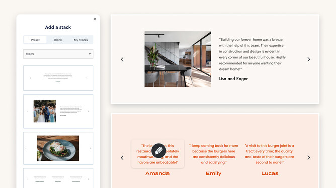
Just like that classic Monopoly chance card, Slider Preset Stacks are your fast track to getting a range of Sliders on your website. You don’t have to be a designer to add great looking sliders to your site. Just open the Preset Stack adder and choose the “Sliders” category to see all the options. Click on the thumbnail and voila, your very own Slider.
The Preset Stacks have placeholder content to give you an idea of the kind of pictures or text that might suit that particular Slider. Next step: replacing that placeholder content with your own text and pictures.
“Adding it to the page looks easy, but is it truly easy to edit?”
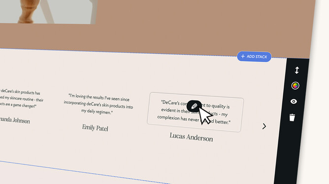
Replacing photos and editing text in sliders is pretty much just like editing any other content on your site. Anything editable has an edit pencil that appears when you move your mouse over it.
We thought about testing this on children but we knew they’d have no trouble with it so we didn’t bother—and we know it’ll be easy for you too. Just kidding, I did test this on my 6 year old and they worked out how to update the text content of multiple Slides talking about their favourite toys—including cute 6 year old spelling 😍. If you’re a technophobe, we see you—this one’s for you.
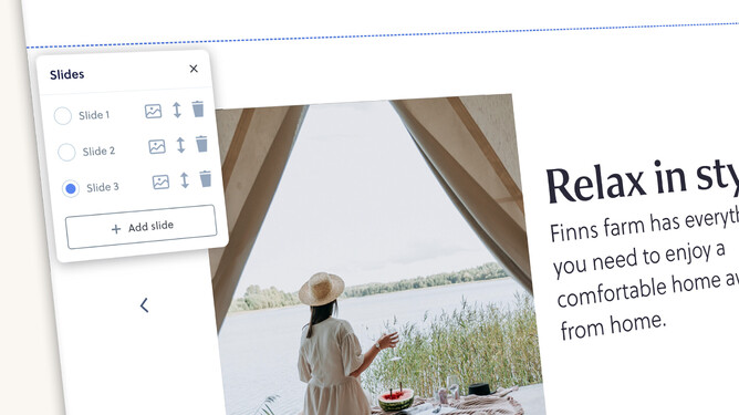
The only difference with a regular stack is this handy little slide switcher—to make it fast and easy to switch to a particular slide (this only shows in editor mode). You don’t have to use the slide switcher for changing slides—you can use the arrows as well. The slide switcher is also how you add, delete and reorder slides.
Colours, fonts, slider controls etc
If a designer designed your website for you on Rocketspark, they may have locked down some of the design controls—but don’t worry, this is a good thing. A key part of the value of working with a designer is that they take care of giving you a consistent look and feel for your brand throughout your website. By locking down things like colours, fonts and some key layouts it’s actually making it easier for you to edit text and replace photos without having to worry about messing up the design or looking ***gasp***..... off-brand. Sliders are no different—they’ll design amazing looking sliders for you then hand you the keys to add more testimonials or projects as they come to hand (without having to pay them a design hourly rate to do these simple content updates).
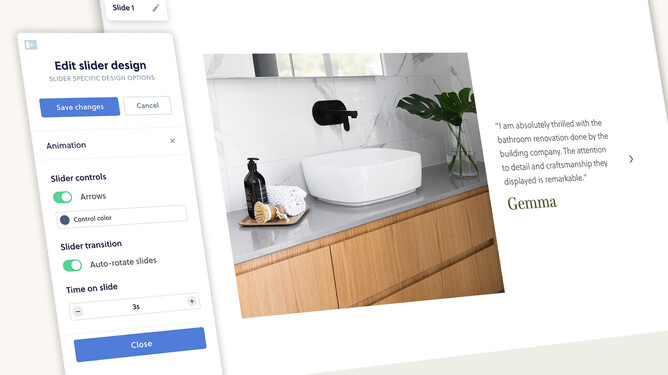
If you designed your own website using Rocketspark, you’ll have access to the standard stack design controls like adjusting fonts, colours and spacing. You’ll also see animation options like whether the Slider should auto-rotate through the slides and how many seconds it should pause on each slide.
Sliders for designers
But what if you’re a designer and want more freedom to design what you see in your mind? We thought long and hard about this one. Designers want to dream up an exact design, but then when they hand the keys over to their clients, they want it easy to update within the design they’ve created. That’s why we’ve created the Slider Maker—a designer-exclusive way to craft any layout you want and convert it to a Slider that’s then easy for clients to replace text, photos and add more slides with the same consistent layout you created for them.
Hidey the slidey — hide stacks until they’re ready to show
With any major project (we started dreaming up this one a year ago!) there’s often a feature or two that don’t make the cut on the first version, as we balance getting the feature in the hands of customers sooner vs getting every imaginable feature.
Copying stacks is a much-loved feature of Rocketspark that makes it easy to copy a stack to another page and have the content and/or the design linked up, mirroring each other on different pages. For this first version of Sliders, you won’t be able to copy them — but this is something we’d like to take care of in future.
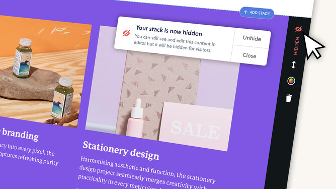
So that you’re not having to tinker away on a Slider while it’s live on your home page, we’ve created an easy new way to hide stacks while you’re editing them. Just click on the eye icon in the stack controls and it’ll hide that stack for visitors to your website — you’ll still be able to edit it as usual in editor mode.
Hiding stacks isn’t just handy for Sliders. This feature has a bunch of use cases like being able to draft up a seasonal stack and setting it live when you’re ready. Or if there’s something you want to hide for a time and bring back at a later date.
Slide the feedback our way!
We hope you love how easy it is to add Sliders to your website.
If there’s a particular Slider design you’d like to see added, it’s easy for us to add more Slider Preset Stacks library. Just reach out to us and we can take a look for you — because with Rocketspark you’re never alone.
If there’s something about the Slider you don’t like or would like added as a feature, whether it’s dots for navigation instead of arrows, copying sliders or something else, we’d love to hear about this too. We’re always listening to feedback to find new ways to improve Rocketspark.
