As mobile website visitor traffic has continued to soar, we’ve worked on progressing the mobile design experience for our customers, as well as the mobile viewing experience for their customers.
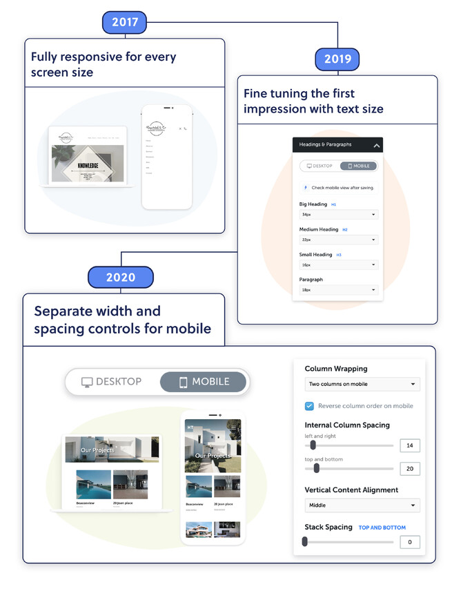
At Rocketspark we’ve seen first hand that for many industries more than half of their web traffic is on a mobile and for some clients as high as 80%. In 2017 we went fully responsive for every screen size. In 2019 we released our mobile feature area controls for fine tuning the first impression of your website on mobile—and the ability to fine tune the size of all of your text on mobile. Now at the end of 2020 we’re pleased to announce the next stage of mobile design progression with separate width and spacing controls for mobile—for more control over the layout of your mobile website design—for a beautifully designed website on every screen.
On Rocketspark’s website builder you now have the option to have two column layouts on mobile, as well as the ability to reorder content in a stack to suit your desired design vision.
Mobile spacing controls for the perfect mobile design
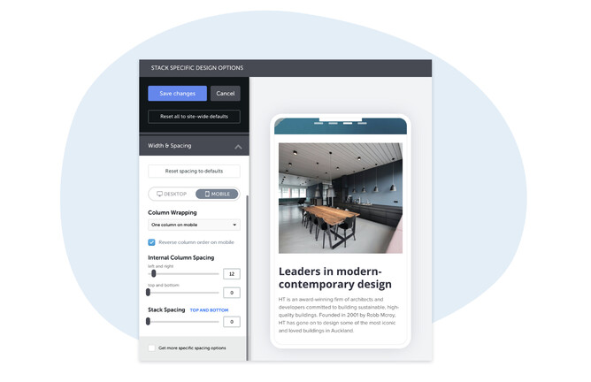
You now have separate column spacing controls for desktop and mobile. By separating these key design controls, you can confidently edit your design for the desktop space knowing the mobile website won’t be compromised. It’s now easier than ever to alter your mobile website design to suit this smaller screen by simply flicking over to the new mobile editing tools and adjusting the spacing of your content elements (text, images, videos) in relation to the edge of the mobile screen.
See the help guide: How to adjust content width & spacing for mobile
Display side by side content on mobile
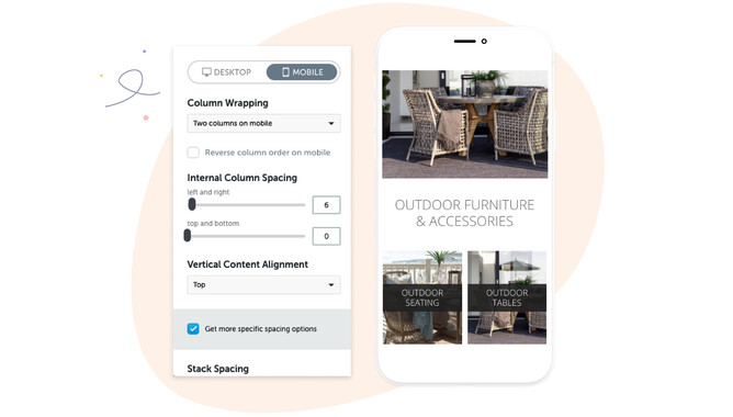
A 2 column stack on desktop can now be set as 1 or 2 columns on mobile.
Having designed your website to display on a desktop screen with a 2 column layout can result in the columns wrapping on a mobile screen to sit one underneath the other. Sometimes, particularly with very long pages, you might want to instead display content side by side (horizontally) in two columns to reduce scrolling and/or for the purpose of keeping images in context with messaging—and now you can!
See the help guide: How to show a two-column stack on mobile
Adjust the order of content on mobile
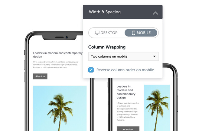
Alternating stack layouts (for desktop) creates a nice visual contrast on desktop, but on mobile the order of content can sometimes look strange.
With the new width and spacing controls for mobile, you can reverse the order of columns on mobile in a single click—really useful for getting your design to look just as sleek on a mobile screen as it does on a desktop.
See the help guide: How to reverse column order on mobile
Look forward to even more mobile web design tools
We hope you’ll love using Rocketspark’s new mobile website design tools, and we look forward to working on more mobile capabilities for you in the near future.


