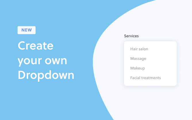
We are excited to announce the release of dropdown menus as a standard feature of Rocketspark on all plans.
For over ten years we've been promoting the importance of clear, simple website visitor journeys—the kinds of experiences that don’t leave the visitor confused or overwhelmed. Used badly, dropdown menus can really go against the grain on that and lead to overwhelming rabbit warrens of a website structure and that’s why we’ve guided people towards alternatives.
Over time, our view of dropdown menus has warmed a little—as we’ve started to see examples of dropdowns done well. Used sparingly for a specific purpose, a simple dropdown menu can have its place. It has also been one of our largest feature requests of all time, so we understand that business owners and designers love the ability to add a dropdown or two.
Happy customers equal more enquiries or sales. When your website navigation is done well, you’re more likely to be successful online. Not only does good navigation allow your viewers to enjoy their browsing journey through your website but it’ll affect the number of visitors that reach your site in the first place. Dropdown menus, when used thoughtfully, can contribute to great website navigation so we’re going to give you some tips on how to use this feature effectively.
What exactly is a dropdown menu?
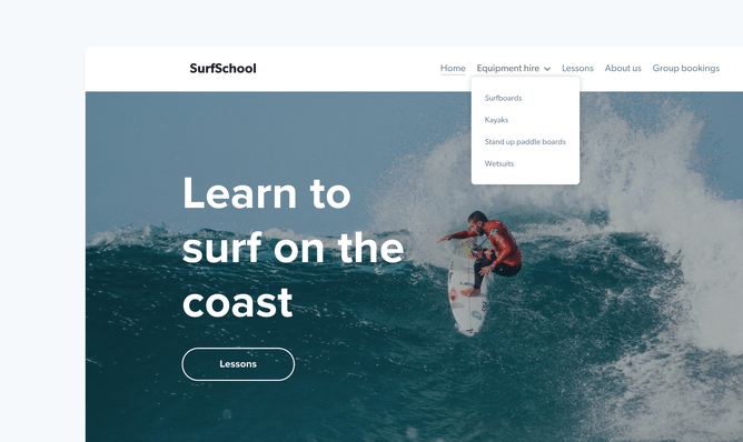
Dropdown menus are often used in the main menu section of a website which is usually situated at the top or sometimes on the left hand side of the browser window. They’re a secondary menu within a parent menu (the main menu for instance)—that appears when you mouse over one of the parent menu items. It can be used to display related pages that can be grouped under a parent topic, to make more specific content easy to find for people that are interested in it. Dropdown menus are about augmenting the design of the page and shouldn’t be a replacement for call to actions on the page.
When's a good time to use a dropdown menu?
If your organisation covers a wide variety of topics, services or subcategories, dropdown menus can be super helpful in getting your website viewers to where they want to go—fast.
Ecommerce and the dropdown menu
A dropdown menu can be a great tool for ecommerce or online stores. With Rocketspark there are already a number of navigation options for businesses with categories, product tags and brands. However for those businesses who offer a larger amount of subcategories within those segmentations, a dropdown menu could provide a handy filtering solution for their customers.
Give your customers a fast and easy way to get to where they want to go. Take this common scenario for example. A customer is browsing a number of online stores simultaneously for a winter jacket. As an ecommerce business, for the best chance to convert and make a sale you want your viewers to have an engaging and simple browsing experience on your website. In addition to your main call-to-actions on your homepage, you could add a dropdown menu subcategory called Jackets & Coats under a main/parent menu.
Dropdown menus are also a fast way of showing the services your business offers—accessible from anywhere on the site. If you’re a tourism and/or accommodation provider, you could use a dropdown menu to easily direct and match your customers with what they’re looking for with rooms that are separated by size, type or number of rooms per suite etc.
An intuitive mobile dropdown experience
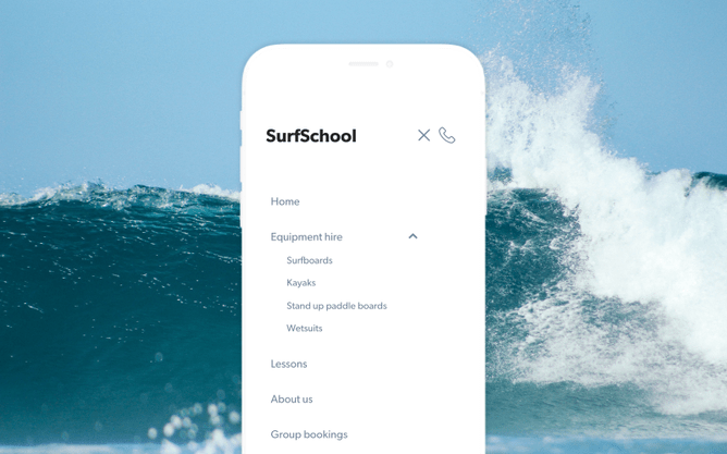
Yes, your dropdown menu will perform just as well as it does on a desktop. However, instead of opening with a mouse or finger rollover like this menu would function on a desktop, the viewer will follow visual clues to tap the main menu item to open the dropdown menu on their mobile.
Creating a user-experience that captivates the viewer
Although dropdown menus have been one of our most highly requested features here at Rocketspark, we do suggest using them thoughtfully. Design a user journey that doesn’t rely solely on your main menu. It’s important to have clear call-to-actions on your homepage and throughout your website to lead viewers around your site seamlessly for the best chance at conversion. They shouldn’t need to use the main menu to get to where they want to go, although this is a good alternative, and maybe even a back-up.
Rather than overwhelming your visitors with countless clickable options on the homepage, a better strategy could be to give them a few well-chosen menu routes that lead to other logically-related options on the next page.
We also suggest you give your main menu options clear and intuitive labels. Don’t be too clever. That’s also the advice of web usability wizard Jakob Nielsen when it comes to choosing your menu labels. Giving your pages unusual, exotic or jargony names just paralyses your users into indecision. Instead, go with tried-and-true labels. Don’t say “Life Solutions”; say “Services”. Don’t say “Future Horizons”; say “Jobs”. That’s right—be boring, be unoriginal. Your visitors will thank you for it.
Need something a little different?
Dropdown menu is a fast and easy solution to set up on your website and it’s included in all 3 Rocketspark pricing plans. If for whatever reason a dropdown menu isn’t what you’re looking for, we do have other commissionable menu options available on Rocketspark. Contact us if you would like a quote on getting one of these set up on your website.
Sticky headers
If you want to arrange your website for better user navigation using a different tool from dropdown menus, sticky header can be a good option. This is especially true when you have a long page—it allows your main menu to be fixed to the top of the page so that it won’t disappear from people’s view as they scroll down.
Sticky sub menus
Different from grouping your secondary pages to attach to the main menu in a vertical view, you can display key sections on a single page on the secondary level in a horizontal view, right below your main menu.
There are plenty of examples that show how sticky headers and sticky sub menus work together in offering better navigation—the key menu items on a sticky sub menu are pulled from the main headings of each section on a page. By clicking on one of them, your viewers can be directed straight to a relevant section. As they scroll, the sticky menus stay stuck at the top of the window and as they scroll past each section on the page, it highlights which section the viewers have scrolled to.
Mega dropdown menus
Mega menus are popular with online stores—they’re large pane-like menus that let you pull shop categories/tags/brands into sub-categories and all sorts of other things that garden variety dropdowns just can’t do. The Nielsen Norman Group (NNG), specialists in web design user testing, have found that mega-menus perform well. In a sense, it’s a bit like giving your user a sneak peek of another (miniaturised) page without requiring them to click and wait; it’s not actually a separate page of course—it’s still a dropdown menu—but its increased functionality means it works a bit like one. See example of how Pure and Wholesome uses a mega dropdown menu which pulls in categories, brands and more from their shop.
Easy to set up and ready in minutes
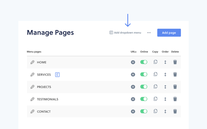
You can get your website viewers to where you, or they want to go in the fastest time possible by adding a dropdown menu. It’s not only a breeze for you to set up on your Rocketspark website, but it takes just a few clicks to do!
Head to our step-by-step help guide to see how to add a dropdown menu.
If you don’t have a Rocketspark website, go to rocketspark.com and click Get Started to start your 30-day free trial.


