Designing the first Rocketspark logo from the bedroom of a Hamilton flat in 2008, I never could have imagined the adventure we would go on for the next decade. What went from a bit of a DIY moonlighting project is now a business with thousands of clients in dozens of countries, employing nearly 20 staff.
In December 2018, I sat down with our designer Natalie Trow and asked for her design vision for Rocketspark. She listed a new website for Rocketspark, Full-width Stacks, Grid Gallery and a new logo for Rocketspark. I’m pleased to say that now all of those tasks are completed — but first, a little background.
Forging a brand
There were 3 key values that Rocketspark was founded on that are still true today:
- Make it so easy anyone could use it
- A genuine desire to help clients
- A focus on quality
In the early days of Rocketspark, these things were the aim and what shaped our decisions and behaviour — but as a fledgeling bootstrapped startup without big investor money we didn’t yet have a reputation. All of our business came from word of mouth referrals and family networks.
After 7-8 years of staying true to our values, building our customer base and growing our product, we started to notice that new customers were hearing about us from multiple positive referrals. As a student designer, I had always considered a logo and a brand as one in the same, but Jeff Bezos, who started Amazon in his garage in 1994 once said that “Your brand is what other people say about you when you’re not in the room”.
Consistent to our values, people were saying things like the following feedback that came in this month:
“Frankly, and honestly, I am stunned by the willingness of your team to help me. I have specific learning needs and prefer to ‘be told’ even the most simple things, but when I have the hang of these many new terms (blocks which stack, and Favicons) I can unleash my creativity and ride like the wind. I am very happy and very excited and I look forward to a long term relationship with you. A personal ‘thank you’ to those of your team who have been patient, thoughtful and kind.”
“Everything about your company is awesome: your attitude, your willingness to help, your insistence on following-through on an enquiry. Your team has really empowered me and I am delighted with my site. It needs a tweak or two before launch in July, but really, I never thought I could do this. Thank you all, so much.”
We were starting to see the fruit of our focus on our values. A brand was being forged under the pressure of years of hard work. But over time we began to realise that our 2008 logo was out of step with this brand.
Getting a logo that matches the brand

Our logo was well received in 2008 — and for a new business with no customers, a strong looking brand that was bold and confident felt appropriate. As our brand around simplicity and eagerness to help people began to flourish, the black white and red, all caps, heavy bold logo styling felt out of step with this more comfortable, relaxed brand. We decided we needed to go for a lowercase type so it didn’t FEEL LIKE WE WERE SHOUTING, a typeface that was semibold so it wasn’t lost in a design — but also wasn’t too heavy. We wanted a logo that could work well on both a light and a dark background but with a preference for a light background more often than not. We wanted a logo with some colour so it felt friendly and inviting and not corporate and boring.
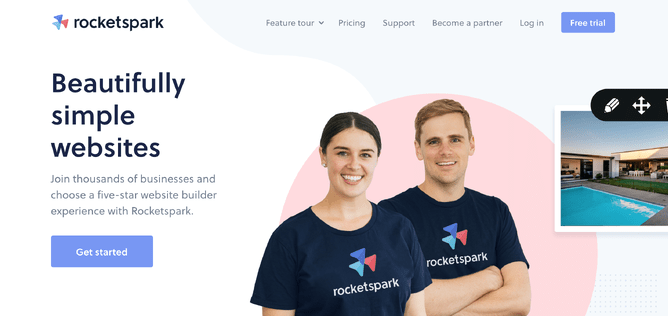
We actually redesigned our website to match our brand, knowing a new logo was in the pipeline but not yet designed. By aligning the design aesthetic and visual identity with our brand, we knew that when we did design a new logo, there was a strong chance it would match the look and feel of the website.
Battling the rocket cliché
We decided to embark on an internal redesign of the logo, collaborating between myself, Natalie Trow and a student designer on the team, Kalei Esteves. Each person added a piece of the puzzle and we managed to nail down the text component of the logo so that we were happy with it. We knew it needed something illustrative to go with the text and with a name like Rocketspark a Rocket is the obvious choice — however, try as we might, the hundreds of icons we designed all looked too clichéd.
After a few anxious weeks from the designers and a little bit of design by committee with the marketing team, we came across a design that connected with both the designers and the team.
Flying in formation for a common goal
The new icon symbolises movement upwards, growth, working together for a greater good. All sentiment that led us to choosing the name Rocketspark back in 2008 — that a Rocket could soar to outer space yet still starts with just a spark at ignition. The three different abstract Rockets represent the symbiotic relationship between Rocketspark, our clients and our design partners.
Our design partners have become a crucial part of the business and many of our new customers are utilising the skills of a design partner to help them get set up with their website. Many clients also start out DIY then once their business reaches new heights, they have some budget to be able to pay a design partner to take their website to the next level.
We finalised this icon weeks before COVID-19 turned the world upside down and it has taken on a whole new layer of gravitas for us as we see many clients fighting for the survival of their business, friends and family facing job losses. The statement we’re all in this together has become prominent and all the more pertinent at this time.
The community that has developed with Rocketspark design partners has also been special to watch as they rally behind our mutual clients. Many of them have lost contracts as a result of COVID-19 and yet when we put the call out for volunteers to help clients, we had around 30 volunteers in half an hour — graphic designers, marketers, copywriters, virtual PA’s.
The Rocketspark team have been amazing these last 3 weeks and I am so proud of them. They have worked incredibly hard to go EVEN further to help customers and partners in their hour of need. They have put in longer than usual hours and produced some amazing content to help clients navigate the chaos.

A new look for a new decade
Here in New Zealand today, new COVID-19 cases reached single figures again for the first time in weeks and there is a sense of hope that life will slowly start to return to a new version of normal.
But the world has changed.
Business in the next 10 years may look very different to the last. We are excited to be starting this new decade with a new look and the same brand values.
