If you’ve read many of our other posts you’ll know that have a good call to action button is a key part of any website journey.
The Rocketspark picture block is beautifully simple to use but it also has a great range of design settings, so you can create great looking picture buttons with overlaid text and nice hover effects that add a little sophistication to your website.. In this blog post we’re going to showcase some of the real Rocketspark customers that are using unique picture effects for visually interesting picture buttons on their website.
Colour overlays and hover text
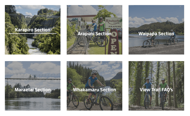
This example uses a three column stack of uniformly shaped pictures with title text overlaid and a slight charcoal overlay to make the text stand out. On mouse-over, the overlay fades away and a line animate appears below the text as it slides up slightly.
Add a shape to suit your design
This example uses a four column stack of images with the circle effect applied. On mouse-over a blue overlay is applied and a line animate appears from the left.
Reveal more detail as you hover
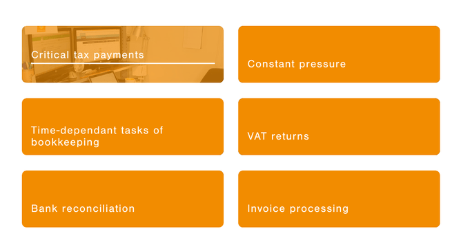
On this example, the pictures have a 100% opacity orange overlay so the picture isn’t visible until you mouse-over, to reveal the orange tinted image. They also have rounded corners and on mouseover the text animates and a line appears.
Subtle text movement to encourage a click
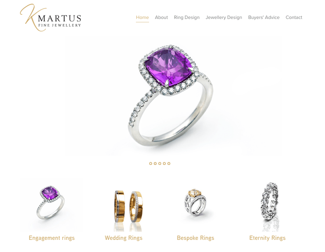
This example uses a four column grid of clear cut images on a white background for a luxurious look and feel. On mouseover the text animates in a very subtle way and the titles appear below the image so as not to detract from the detail of the jewellery but still invite you to click.
Borders that change add an extra dimension
This example uses icon pictures with a white background colour the same as the page background. It then uses the circle effect in the picture block and a 2px border is applied in pale grey. On mouseover this border changes to a blue/green colour.
Steps to making a cool picture button for yourself
- Select an image that will work at a small size on the page or you can zoom in on a particular part of an image to make it more detailed.
- Choose square, circle or rounded corners picture shape.
- Add title text.
- Choose a link destination for the button.
- Add a mouseover effect. These can be:
- Colour overlay effects.
- Black and white.
- Blur effects.
- As well as a range of animating title effects.
Check out our Picture Block help guide and give it a try for yourself.
Further reading:
